


This Bold, Masculine Home is Also Surprisingly Functional
Britany Simon flexes her design muscles for a function-over-form client’s Arcadia home.
By John Roark | Photography by Nick Sorensen
Interior designer Britany Simon loves a challenge. When a client bought a “white box” spec home and tasked her with making it more “him,” she welcomed the opportunity to do something a little different.
“We had completed another project with this client, so we had a sense of what he wanted,” she recalls. “He’s a no-frills, no-nonsense kind of guy. The house was very well done, and there were a lot of things he liked about it. He just needed a little bit more to make it cozier and add some contrast and dimension.
“We always like to try something new,” Simon continues. “This project was a lot of fun because it showed us we can do a modern, dark, masculine vibe. We love color, but we also love designing without it and showing what we can do in a tonally different space.”
On these pages, Simon shares her design process and provides takeaways for creating functional—but dramatic—interiors.
THE ENTRY
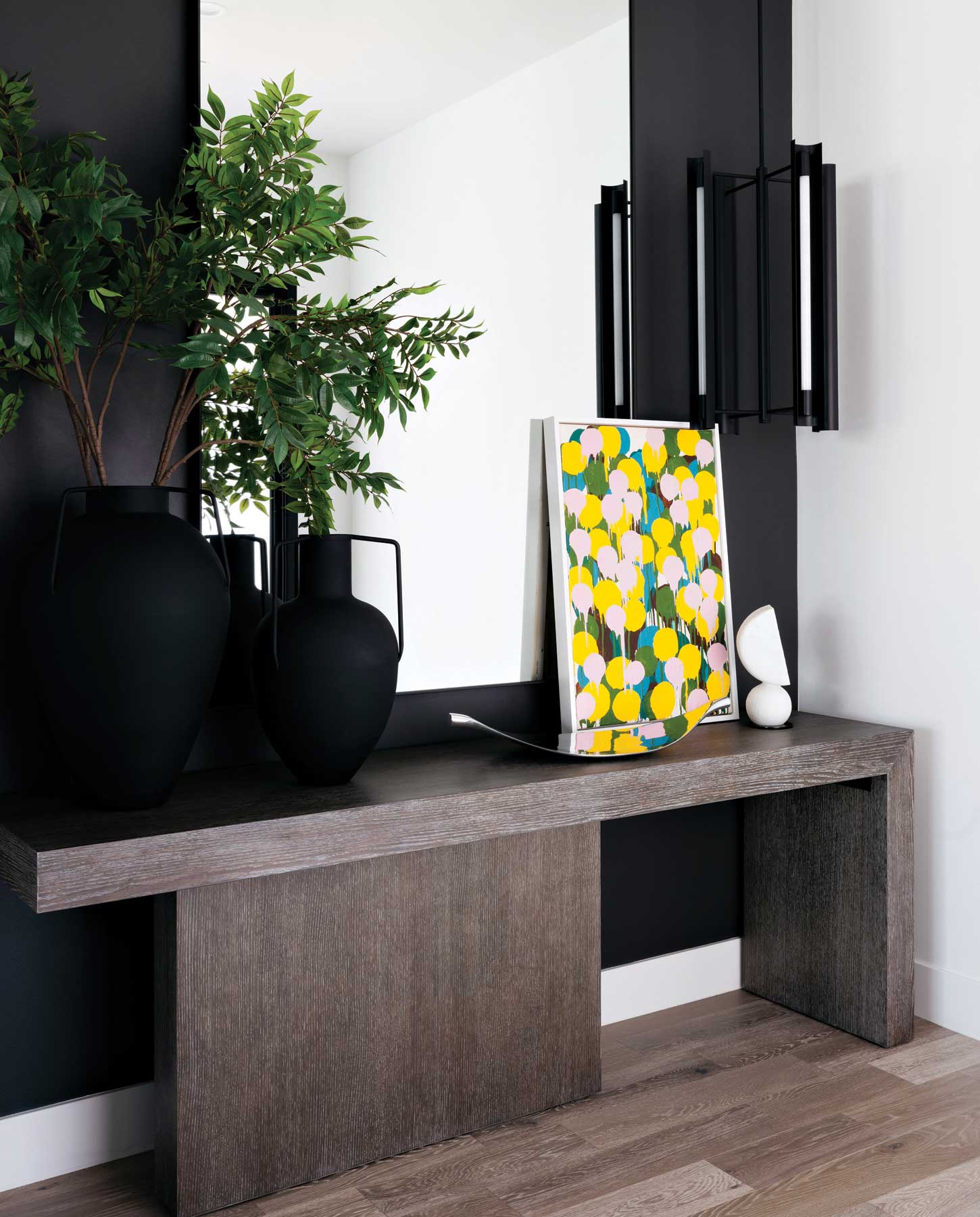
Simon chose an asymmetrical console for the entry, with a pendant light on one side. “When you walk into an open-concept house, you want to have a landing point, a moment that lets you know this is your entry,” she says. Originally, all of the walls were white, but the designer chose black, which echoes accents throughout the home. An oversized mirror bounces light from the frosted-glass front door, while a small painting adds a punch of color and gives a hint of the personality that comes with the homeowner’s taste in artwork.
Design Takeaways:
“We are big fans of leaning artwork throughout a home. You can easily pick it up, move it around and swap it out for something else. The effect is more curated and less stuffy when artworks are not hung.”
“Symmetry is predictable. Rather than having a mirror with two sconces, I like offsetting one pendant and balancing it with something else—in this case, black vessels and greenery. It makes it feel a little more artistic and out-of-the-box.”
THE DINING ROOM
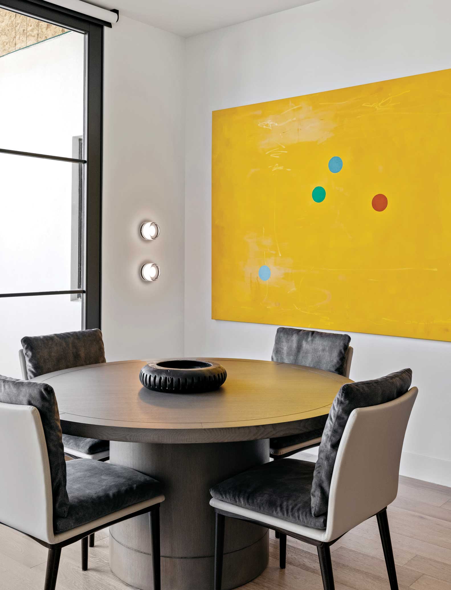
“We kept the dining nook simple and utilitarian,” recalls Simon, who added two-tone chairs with leather backs and velvet seat cushions. “Comfort and texture were what the client was drawn to.”
Finding the perfect artwork took some time. “We looked at a lot of pieces,” Simon explains. “The more we dove in, the more we realized the client does like color—in his art only—and colors you would not expect. This piece made that entire space come alive. Because the interiors are primarily black, white and gray, the art really pops.”
Design Takeaway:
Resist impulse purchasing when it comes to art. It’s fine to have blank walls for a while. Live in your spaces and wait until you find something meaningful to you. I encourage people to look around and shop for affordable art. If a piece speaks to you, it will mean more.”
“People tend to think if you do something dark, it makes it drab, cold or uninviting. I disagree.”
—Britany Simon, interior designer
THE KITCHEN
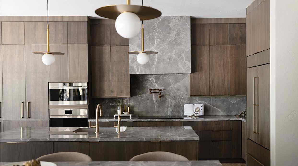
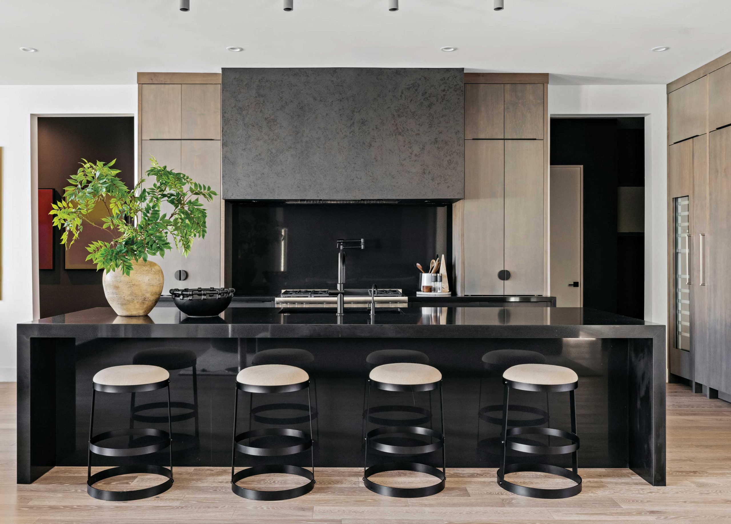
The original white range hood was repainted metallic black, which mimics Venetian plaster but is more durable. This feature bookends the fireplace on the opposite wall of the adjacent great room. Because the client eschews pendant lights, the designer went with monopoint lighting above the island for a sleek, uncluttered aesthetic. Existing cabinetry flanking the range goes all the way to the countertop. “The reality is that in most cases, you’ve got one prep space that you always use, plus your cooking areas,” Simon observes. “If you feel like you have to fill your kitchen counter with purely decorative items, you probably have too much countertop space.”
Design Takeaway:
“For kitchen islands, I tend to prefer backless stools because they can tuck under the island and be out of the way. They can disappear and let the kitchen be the star of the show.”
THE GREAT ROOM
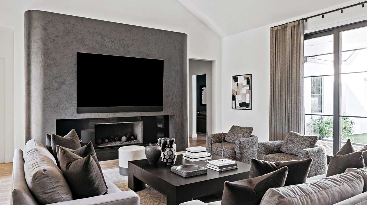
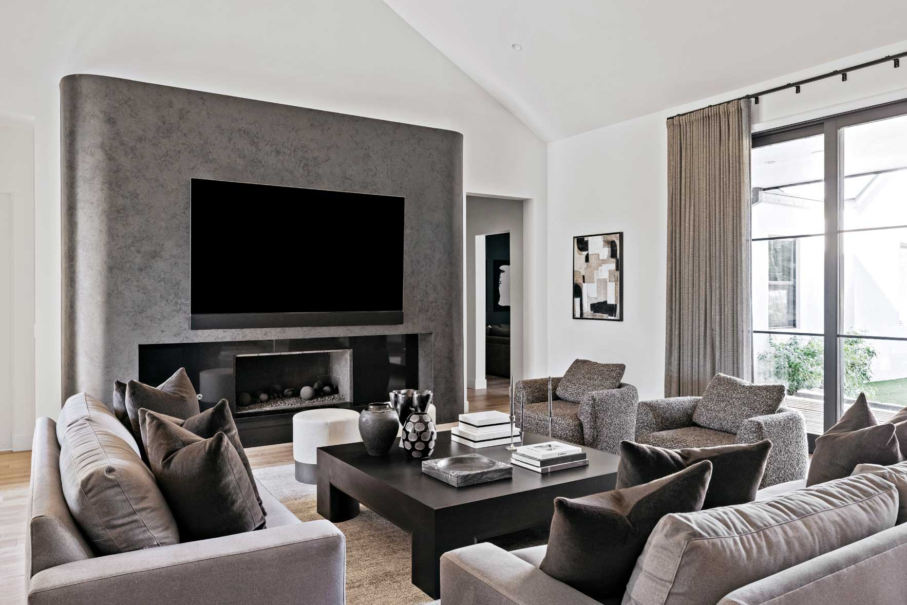
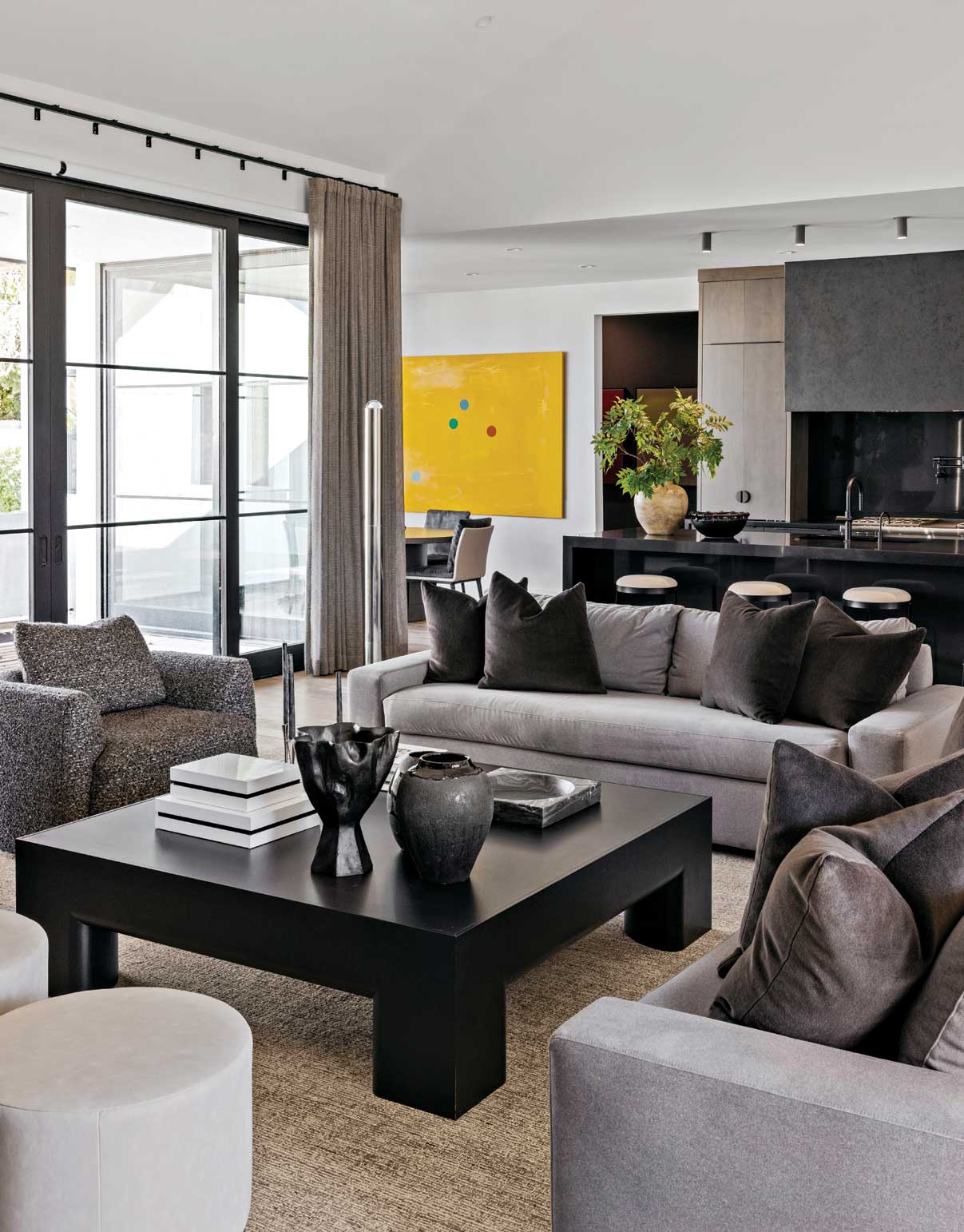
The fireplace anchors the sizable great room. Simon had it refinished in the same moody metallic black as the kitchen’s range hood. “The feature was originally white, making the presence of the television much more obvious,” Simon says. “A dark, chunky coffee table balances out the other black elements and makes it feel more intentional in the space.”
Furnishings embrace the homeowner’s function-first sensibility. “This is his main living space,” Simon says. “We had to have enough room and seating for entertaining.” The solution: oversized sofas and chairs. “I’m not a big fan of sectionals in a great room because nobody really uses them. Swivel chairs enable people to be part of multiple conversations.”
DESIGN TAKEAWAYS:
“We almost always have ottomans within a seating area because you can pick them up and move them around. I love having multifunctional stool seating within a space.”
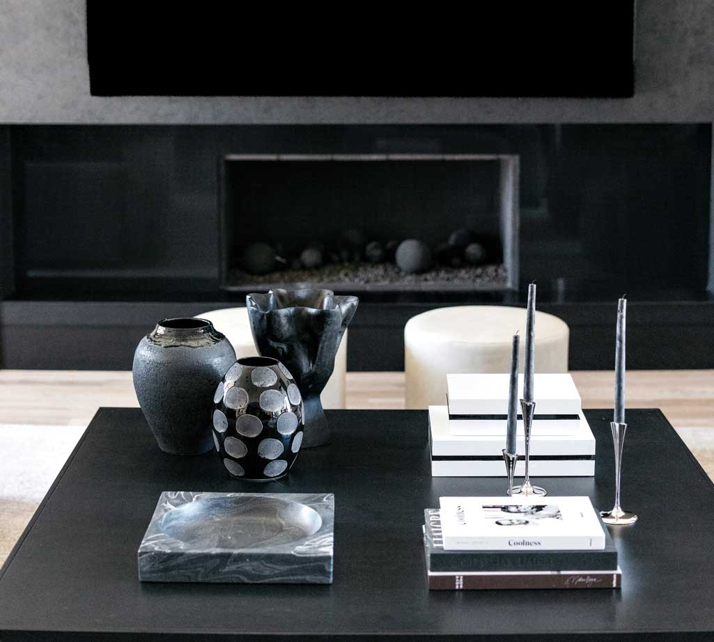
“When it comes to coffee table elements, we like a tiered approach: perhaps a bowl that sits lower; a stack of books a little higher. Vases, vessels or candlesticks bring in extra height. Play around—there’s no right or wrong way to place the items, but having those varying levels is important.”
THE BEDROOM
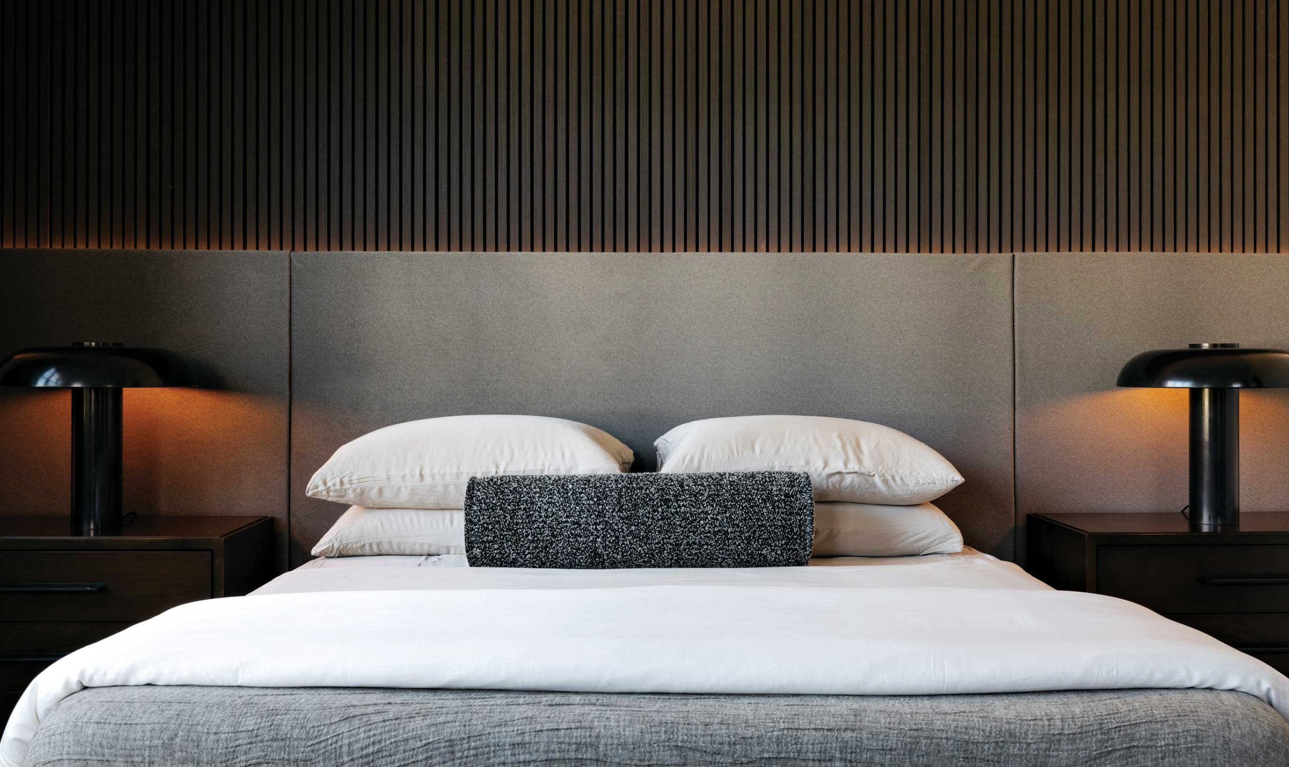
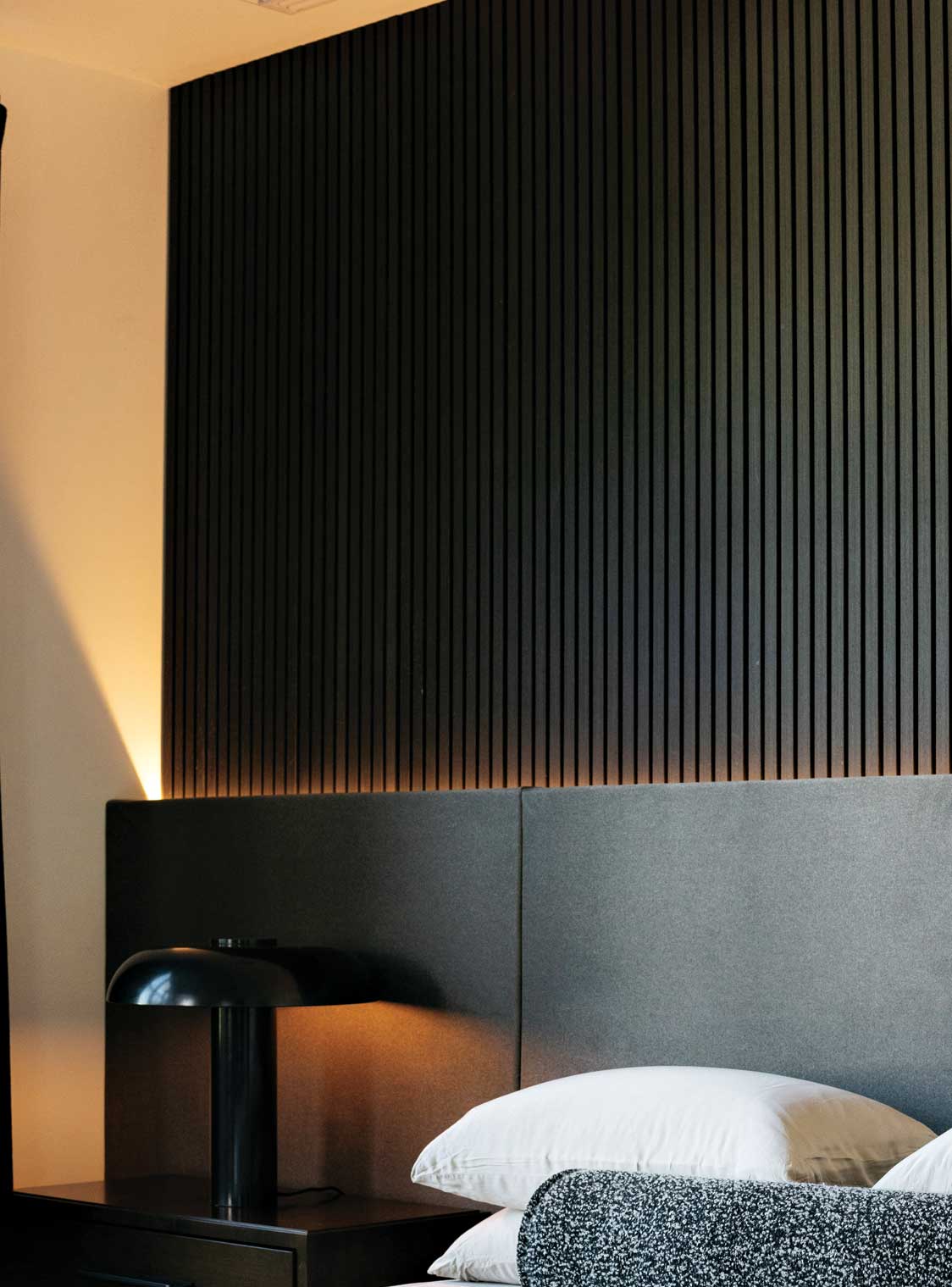
“By Arizona standards, this primary bedroom is small,” says Simon. “Sometimes I think our bedrooms are too big, and it feels like a large space to fill with furniture that no one will use.” Fluted wooden acoustic panels with hidden LED lighting above the textured velvet headboard create a floor-to-ceiling statement that defines the room. “If you had a bed in the middle of the wall with nightstands and lamps, the bedroom would feel smaller than it is. Incorporating a wall-to-wall, floor-to-ceiling feature minimizes the bed just sitting in the middle of the room.
DESIGN TAKEAWAYS:
“Overhead should not be your main lighting source in a bedroom. It is important not only to have lamps, but to incorporate other ways of lighting the space to give you some alternate choices.”
“When you are working with a neutral color palette, it’s important to augment the textures, where possible. That’s why we chose gauzy bedding with a coverlet; linen sheets and pillow cases; and a nubby bolster. All of those elements add to that texture story.”
SOURCES
- Interior designer: Britany Simon, Britany Simon Design House, Scottsdale, britanysimon.com
ENTRY
- Console table: vanguardfurniture.com
- Art (by Marvin Wilkinson): John Brooks Inc., Scottsdale, johnbrooksinc.com
- Pendant: visualcomfort.com
- Oversized mirror: rejuvenation.com
- Black metal vases: arhaus.com
- Stems: Askren & Sons Inc., Phoenix, askrenandsons.com
DINING NOOK
- Table: vanguardfurniture.com
- Chairs (by Constantini Pietro): Alexander Sinclair, Scottsdale, alexandersinclairshowroom.com
- Art (Marvin Wilkinson): johnbrooksinc.com
KITCHEN
- Counter stools: noirfurniturela.com
- Custom finish on hood: Webart, Phoenix, webartphx.com
- Stems: askrenandsons.com
GREAT ROOM
- Finish on fireplace (custom): webartphx.com
- Oversized sofas (custom): Pacific Furniture Manufacturing, Phoenix, pacificseasons.com
- Coffee table, swivel chairs and ottomans: vanguardfurniture.com
- Rug: Floor Styles, Scottsdale, floorstyles.com
- Art: Costello Gallery, Scottsdale, costellogallery.com
- Floor lamp: visualcomfort.com
- Sheers: Athena’s Window Fashions, Gilbert, athenaswindows.com
PRIMARY BEDROOM
- Wall bed (custom): Evolve Furniture LLC, Scottsdale, evolvefurniture.net
- Wood slats above bed: woodpanelwalls.com
- Lamps: visualcomfort.com
- Bedding: cozyearth.com